

Overview
Federal Student Aid's chatbot assistant, Aidan, was designed to address common student aid-related issues. Built using Google's Dialog Flow, Aidan can answer questions on FAFSA, loan forgiveness, Income-Driven Repayment plans, and even share the occasional light-hearted joke. Serving 4.3 million users annually, Aidan has proven to be a powerful AI tool, accounting for over 2% of StudentAid.gov’s annual traffic.
*Note: 2% of total session traffic is substantial given total StudentAid.gov product offerings.
Project Scope
UI/UX overhaul
Tools


Role
Lead UI/UX Designer
Team
4
Developers
1
UX Designers
1
Product Owner
3
Analysts
1
Scrum Master
4
Developers
1
UX Designers
1
Product Owner
3
Analysts
1
Scrum Master
4
Developers
1
UX Designers
1
Product Owner
3
Analysts
1
Scrum Master
Audience
4.3 million annual users
Duration
2 years
Challenge
While Aidan has proven to be a powerful tool, it still faces several challenges. Most notably, users report that Aidan struggles to understand certain questions, leading to increased frustration. Additionally, the Aidan team has faced difficulty matching intents (series of responses) with user feedback, making it challenging to address these pain points effectively.
Moreover, users frequently request to speak with a human, resulting in high-cost interactions. Finally, mobile usage lags behind desktop due to the low visual prominence of Aidan on mobile devices compared to its desktop counterpart.
Business Goals
Increase mobile device usage rate
Improve quality of feedback collected from users
Mondernize UI to match experiences in private sector
Increase positive outcomes from using chatbot assistant
Business Goals
Increase mobile device usage rate
Improve quality of feedback collected from users
Mondernize UI to match experiences in private sector
Increase positive outcomes from using chatbot assistant
Business Goals
Increase mobile device usage rate
Improve quality of feedback collected from users
Mondernize UI to match experiences in private sector
Increase positive outcomes from using chatbot assistant

Aidan by the numbers.
12,000+
Daily Sessions
20-29
Top Age Range
2.24
Messages Per Session
55%
Not Logged In
Aidan by the numbers.
12,000+
Daily Sessions
20-29
Top Age Range
2.24
Messages Per Session
55%
Not Logged In
Aidan by the numbers.
12,000+
Daily Sessions
20-29
Top Age Range
2.24
Messages Per Session
55%
Not Logged In
01 / Research
Exploring painpoints
Exploring Market Solutions
Before recommending updates and changes to Aidan, I reviewed existing market products, including ChatGPT, Xfinity, Grok, Lyro, and others. This research uncovered key trends in chatbot design and functionality.
Exploring Market Solutions
Before recommending updates and changes to Aidan, I reviewed existing market products, including ChatGPT, Xfinity, Grok, Lyro, and others. This research uncovered key trends in chatbot design and functionality.
Exploring Market Solutions
Before recommending updates and changes to Aidan, I reviewed existing market products, including ChatGPT, Xfinity, Grok, Lyro, and others. This research uncovered key trends in chatbot design and functionality.
Findings
01
Most products, when in a closed state, featured larger avatars (greeting buttons) compared to Aidan. These avatars also incorporated familiar chatbot elements, such as chat bubbles and response dots.
02
Chatbots often featured splash screens or rich HTML experiences upon opening, providing a more engaging user entry point.
03
Feedback mechanisms were seamlessly integrated into the chat and were easily discoverable by users.


Analytics
In addition to reviewing existing market options, I also worked with Aidan’s product owner to review qualitative and quantitative feedback collected with Medallia and Google Analytics.
Analytics
In addition to reviewing existing market options, I also worked with Aidan’s product owner to review qualitative and quantitative feedback collected with Medallia and Google Analytics.
Analytics
In addition to reviewing existing market options, I also worked with Aidan’s product owner to review qualitative and quantitative feedback collected with Medallia and Google Analytics.
Findings
01
Aidan averages 10–12K sessions per day, accounting for approximately 2% of all StudentAid.gov sessions.
02
Most users preferred using Aidan’s pre-written prompts.
03
Users were quick to request for human assistance
04
Users preferred cards or graphic responses over text responses.
05
Roughly 55% of users interact with Aidan while not authenticated, while 45% are authenticated.
06
Aidan's users are primarily younger, with usage gradually declining as age increases.
07
Among younger users, those aged 20–29 stand out with a 32% usage rate.
08
Negative user feedback primarily stems from Aidan's inability to provide accurate answers or assistance (i.e., fallout).
09
On average, Aidan users send 2.24 messages per session
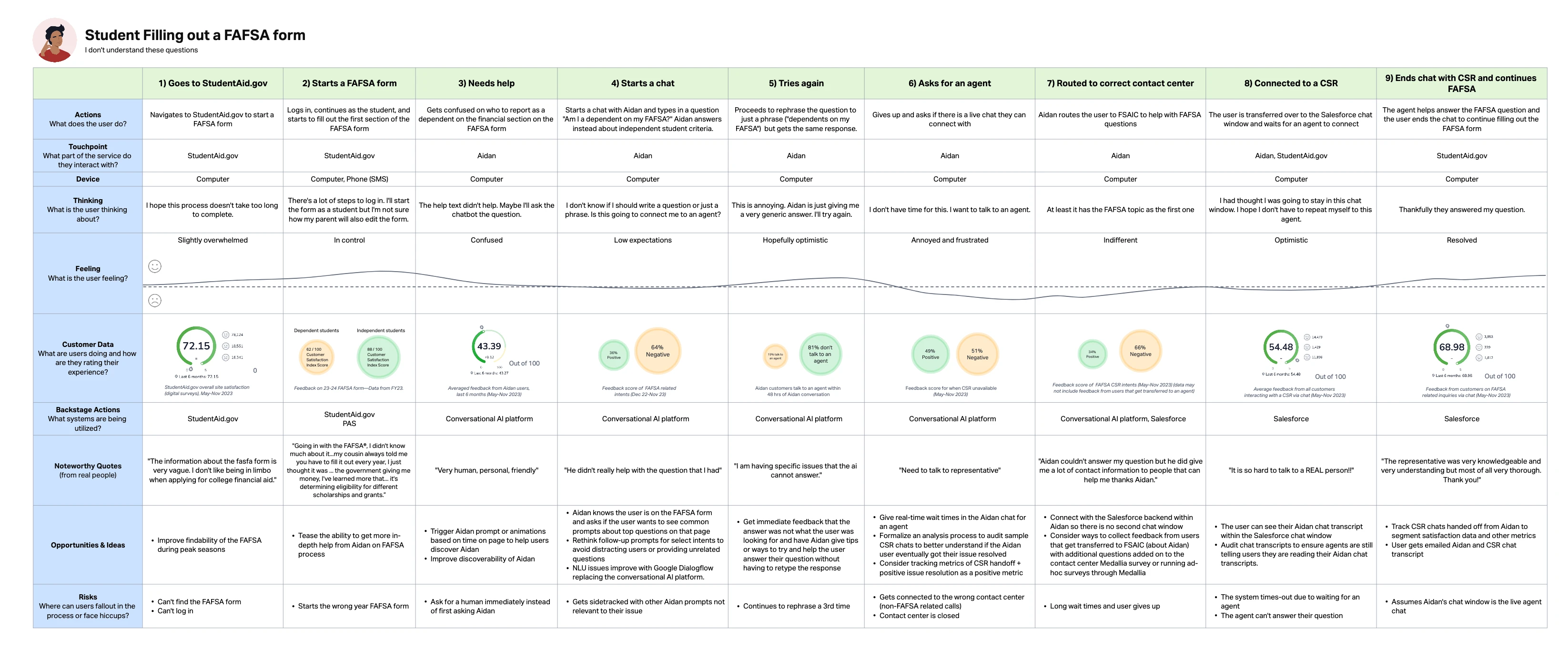
Journey Mapping
To conclude Aidan’s UI refresh research phase, I created four journey maps covering the product’s most common use cases. The journey mapping process included facilitating four discovery brainstorming sessions and six working sessions with FSA stakeholders, product owners, and UX designers.
This journey mapping process led to the identification of multiple improvement opportunities, a new vision statement, and a set of measurable goals and objectives to assess success post-deployment.
Notable Opportunities Identified
01
Provide more options or allow users to cycle through additional pre-defined responses.
02
Make Aidan’s avatar more visible by increasing contrast with the background and incorporating stronger "chat" symbolism.
03
Improve feedback collection mechanisms to gather higher-quality qualitative data.
04
Enable users to rate or review Aidan's responses.
05
Enable Aidan's prompts to be updated or cycled without requiring a code deployment.
06
Use more graphical or card-based responses with clear hierarchical layouts.
*Note: Above opportunities are just a selection from a larger list of recommendations and opportunities


02 / Ideation & Concepting
02 / Ideation & Concepting
Wild ideas welcome
Design Philosophy
During this phase, I encouraged the team—including stakeholders, designers, developers, and the product owner—to think outside the box. However, I also prioritized aligning designs and ideas with user expectations. Given the ubiquity of AI chatbots in today’s market, users have established expectations for how new chatbots should look and feel.
01 Feature
Feedback Panel Variations
Empower detailed feedback with actionable insights with a quick exit.
01 Feature
Feedback Panel Variations
Empower detailed feedback with actionable insights with a quick exit.
01 Feature
Feedback Panel Variations
Empower detailed feedback with actionable insights with a quick exit.
Design Intent
Allow users to provide more detailed responses to clarify their feedback when necessary.
Provide meaningful data for UX researchers and other stakeholders.
Create mechanisms for users to quickly dismiss prompts and return to the chat.
Ensure accessibility compliance by optimizing contrast, text size, and keyboard navigation for all users.


02 Feature
In Chat Feedback Variations
Effortless chatbot feedback: fast, intuitive, and uncluttered.
02 Feature
In Chat Feedback Variations
Effortless chatbot feedback: fast, intuitive, and uncluttered.
02 Feature
In Chat Feedback Variations
Effortless chatbot feedback: fast, intuitive, and uncluttered.
Design Intent
Provide a quick and intuitive way for users to give feedback on Aidan’s responses.
Ensure feedback options are unobtrusive and do not clutter the chat experience.
Align feedback mechanisms with user expectations and established mental models for chatbot interactions.
Design Intent
Provide a quick and intuitive way for users to give feedback on Aidan’s responses.
Ensure feedback options are unobtrusive and do not clutter the chat experience.
Align feedback mechanisms with user expectations and established mental models for chatbot interactions.
Design Intent
Provide a quick and intuitive way for users to give feedback on Aidan’s responses.
Ensure feedback options are unobtrusive and do not clutter the chat experience.
Align feedback mechanisms with user expectations and established mental models for chatbot interactions.


03 Feature
Splash Screen Variations
Modern, scalable splash screen with rich HTML, free messaging, and data-driven prompts.
03 Feature
Splash Screen Variations
Modern, scalable splash screen with rich HTML, free messaging, and data-driven prompts.
03 Feature
Splash Screen Variations
Modern, scalable splash screen with rich HTML, free messaging, and data-driven prompts.
Design Intent
Design a modern, scalable splash screen that can accommodate future functionality.
Ensure users can still write a free-hand message while the splash screen is displayed.
Transition from a basic SMS-style format to a richer HTML experience with clear visual hierarchy.
Track data on prompt selection to refine and optimize prompts, providing users with better options.


04 Feature
PSLF Card Response Variations
Intuitive Public Service Loan Forgiveness (PSLF) progress: clear hierarchy, tailored graphics, with minimal reading.
04 Feature
PSLF Card Response Variations
Intuitive Public Service Loan Forgiveness (PSLF) progress: clear hierarchy, tailored graphics, with minimal reading.
04 Feature
PSLF Card Response Variations
Intuitive Public Service Loan Forgiveness (PSLF) progress: clear hierarchy, tailored graphics, with minimal reading.
Design Intent
Structure data with a clear hierarchy to help users quickly understand their PSLF progress.
Design graphical responses that account for various PSLF scenarios, ensuring users receive relevant and contextual information.
Present information clearly and concisely, minimizing the need for reading or searching.


03 / Design & Testing
03 / Design & Testing
Let's start designing
Usability Testing
After completing two rounds of design delivery with stakeholder feedback, we moved to user testing. Over six days of usability testing—each day focusing on specific users and scenarios—I gathered the necessary insights to refine and improve the design.
Usability Testing
After completing two rounds of design delivery with stakeholder feedback, we moved to user testing. Over six days of usability testing—each day focusing on specific users and scenarios—I gathered the necessary insights to refine and improve the design.
Usability Testing
After completing two rounds of design delivery with stakeholder feedback, we moved to user testing. Over six days of usability testing—each day focusing on specific users and scenarios—I gathered the necessary insights to refine and improve the design.
Key Findings
Since users tend to skim rather than read, prioritize graphical layouts for better engagement and comprehension.
Buttons need to be visually distinct as interactive elements—some prompts currently resemble pills or labels, causing confusion.
Users prefer giving quick feedback (e.g., up/down votes) but are less likely to provide written feedback.
Users tend to dismiss distracting pop-ups—previous versions of Aidan featured a large pop-up on mobile devices that was often ignored.
Design Changes
01 Feature Updates
Feedback Panel Updates
Streamlined the feedback panel by removing redundant labels and options, enhancing key control visibility, and consolidating actions into a single, clear call-to-action.
01 Feature Updates
Feedback Panel Updates
Streamlined the feedback panel by removing redundant labels and options, enhancing key control visibility, and consolidating actions into a single, clear call-to-action.
01 Feature Updates
Feedback Panel Updates
Streamlined the feedback panel by removing redundant labels and options, enhancing key control visibility, and consolidating actions into a single, clear call-to-action.

Change Log
01
Simplified section labels by removing subtext, as it was unnecessary for radio button selections.
02
Removed the “Other” option as it provided no additional value to the product owner and served no functional purpose.
03
Further increased the visibility of the “X” button for easier access.
04
Removed the “optional” text since all form inputs are optional—"required" text is displayed only when necessary.
05
Removed the “optional” text since all form inputs are optional—"required" text is only displayed when applicable.
06
Consolidated actions into a single submit button with a clear and precise call-to-action.
07
Further increased the size and visibility of the “X” button for easier access.
08
Relocated the character counter for the text area to simplify the interface.
02 Feature Updates
In-Chat Feedback Updates
Enhanced the thumbs up/down feedback section by improving button clickability and contrast, adding clear prompt text and section borders, reformatting to a compact horizontal layout, and optimizing text and button dimensions for better usability.
02 Feature Updates
In-Chat Feedback Updates
Enhanced the thumbs up/down feedback section by improving button clickability and contrast, adding clear prompt text and section borders, reformatting to a compact horizontal layout, and optimizing text and button dimensions for better usability.
02 Feature Updates
In-Chat Feedback Updates
Enhanced the thumbs up/down feedback section by improving button clickability and contrast, adding clear prompt text and section borders, reformatting to a compact horizontal layout, and optimizing text and button dimensions for better usability.

Change Log
01
Based on usability testing results from Phase 1, updated vote buttons to improve clickability on both mobile and desktop. Added color and borders to enhance visual contrast and included prompt text to clearly define the purpose of user feedback.
02
Added a border or section break to clearly indicate which content the feedback mechanism applies to, aligning with Aidan's intents.
03
To save space, reformatted the voting mechanism into a horizontal layout and aligned it to the right to mimic the behavior of selecting prompts.
04
Refined text and button colors, and standardized button size by setting a fixed height and width instead of relying on padding for dimensions.
03 Feature Updates
Splash Screen Updates
Optimized the Aidan splash screen by replacing ambiguous icons and redundant labels with minimalist, SA.gov-aligned interactions. Refined button and input styles while enhancing accessibility through improved contrast and clear character counts.
03 Feature Updates
Splash Screen Updates
Optimized the Aidan splash screen by replacing ambiguous icons and redundant labels with minimalist, SA.gov-aligned interactions. Refined button and input styles while enhancing accessibility through improved contrast and clear character counts.
03 Feature Updates
Splash Screen Updates
Optimized the Aidan splash screen by replacing ambiguous icons and redundant labels with minimalist, SA.gov-aligned interactions. Refined button and input styles while enhancing accessibility through improved contrast and clear character counts.

Change Log
01
Replaced the "X" icon with a more appropriate minimize icon, as clicking it does not end or close the Aidan session but simply minimizes it.
02
Removed the “Minimize” text, as the icon alone effectively communicates the minimize function.
03
Lightened the chevron icon color to reduce contrast and visual prominence, aligning with a minimalist design approach.
04
Reused styles from the FAFSA FAQ section to align Aidan with recently implemented SA.gov design standards. Reduced the visual prominence and size of prompts to minimize space usage, particularly on smaller devices.
05
Maintained the existing "Quick Reply" styling to improve clickability, with plans for further refinements in Phase 2 of the UI refresh.
06
Reduced the visual prominence of the "Help Center" to encourage users to engage with Aidan. Eventually removed the "Help Center" reference entirely to further drive users toward Aidan instead of navigating away.
07
Converted "See More Topics" from a link to a button style, opting for primary button styling. Since quick replies and prompts use secondary button designs, this change reinforces that "See More Topics" is an action rather than navigation.
08
Switched to secondary button styling to align with the button's importance. The FAFSA FAQ style freed up space, allowing for the use of the secondary button design.
09
Reverted to primary button styling for consistency, as prompts were using a similar style to the secondary button. Chose not to switch "See More Topics" to a link style, since the behavior of the input aligns more with an action (button behavior) than navigation.
10
Moved away from a unified input/send footer to a distinct, rounded input field and send button, based on usability results and stakeholder feedback.
11
Reintroduced character counts, as they provide valuable information and there was insufficient research to justify their removal. Increased the size and contrast to address accessibility concerns.
12
Slightly decreased contrast to address stakeholder feedback, while still considering accessibility concerns.
04 Feature Updates
PSLF Card Response Updates
Refined the PSLF graphical card in Aidan by streamlining headers and data into concise sentences. Aligned design elements with the upcoming Aid Summary release, optimized mobile touch targets, and updated language to enhance clarity and address policy concerns.

Change Log
01
Removed the "Your PSLF Progress" header, as it seemed redundant with the prominent qualifying payment count text. Added "Cumulative PSLF Payment Count" to clarify how the data point is calculated for the user.
02
Converted data points into concise sentences to streamline the information and make it more digestible.
03
Opted to display dollar amounts to align with other design efforts and maintain consistency across the platform.
04
Removed percentage and internal bar chart data points to streamline development, reduce LEO, and align with the Aid Summary R8.0 PSLF component, as user research didn't support their inclusion.
05
Changed to a button for a larger touch target on mobile.
06
Updated the intro text to include the "last updated" date.
07
Removed "Cumulative PSLF Payment Count" as it was unnecessary and not a user concern. Expanded the summary statement to inform users that qualifying payments are matched across all loans.
08
Swapped "Your Loans" for "PSLF Progress" to align with Aid Summary R8.0 designs. Moved the "showing x out of y" text higher and made it more prominent in the design.
09
Switched from displaying dollar amounts to loan types based on usability testing results.
10
Updated phrasing from "PSLF Loans" or similar to "Loans," "PSLF Progress," or "PSLF Payment Progress" in anticipation of policy concerns.
Final Designs & Takeaways
Final Designs & Takeaways
Taking a look back
Final Designs

Final Thoughts + GenAI Next?
The Aidan UI refresh project successfully addressed key user pain points, enhancing the chatbot’s accessibility and user experience across devices. By leveraging data to inform design decisions, the team improved the UI’s functionality, making Aidan more intuitive and easier to engage with—particularly on mobile devices. These improvements led to a more seamless and efficient experience for users seeking information on federal student aid.
Looking ahead, there’s significant opportunity to build on this progress by incorporating GenAI to enhance Aidan’s response quality and reduce reliance on human operators. Piloting GenAI versions will also help Aidan better match user intents and further streamline user interactions. As these advancements are implemented, Aidan will continue to evolve into a more intelligent and impactful tool for students navigating federal student aid.


